Environmental Health Gap 
Problem Statement
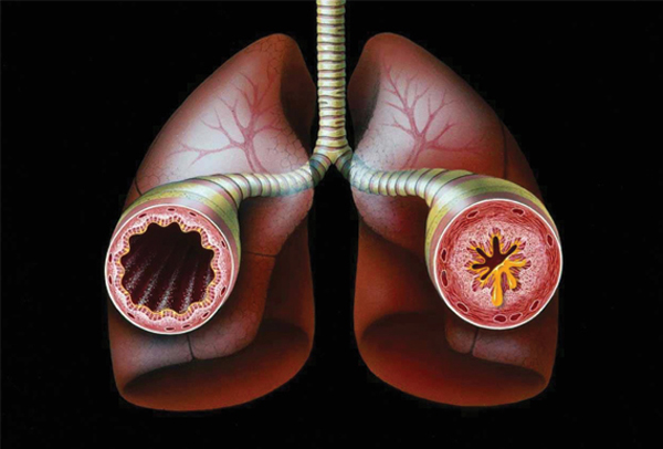
Chronic illnesses kill 7 out of 10 people in the United States every year and result in hundreds of billions in health care costs. There is growing evidence connecting environmental factors to many of these chronic illnesses. However, there is a knowledge gap concerning the strength and prevalence of this link. Our project attempts to reduce the gap by geographically correlating air pollutants with the illnesses they may cause or exacerbate, hopefully leading to better policy decisions concerning the tradeoff between health care treatment and environmental regulation and to more efficient targeting of resources based on severity of need.
Specifically, the project will link emissions data from the EPA and the California Department of Public Health in an attempt to find a correlation between incidences of asthma treatments and emissions seen as triggers for asthma.

About the Data
Emissions
Source
United States Environmental Protection Agency's Air Quality System (AQS) Data Mart
https://ofmext.epa.gov/AQDMRS/aqdmrs.html
Ozone
Emitter facility level ozone readings parts per million
Link to Health
Ozone can worsen bronchitis, emphysema, and asthma. Ground level ozone also can reduce lung function and inflame the linings of the lungs. Repeated exposure may permanently scar lung tissue, increase the frequency of asthma attacks, and make the lungs more susceptible to infection.
Particulate Matter less than 2.5 microns
Emitter facility level readings in micrograms/cubic meter (LC)
Link to Health
Particle pollution can include one or more different chemical components, including acids (such as nitrates and sulfates), organic chemicals, metals, and soil or dust particles. The size of particles has been linked to their potential for causing health problems since it is easier for smaller particles to bypass protective mechanisms in the nose and throat and enter deeply into the lungs.
Health
Source
California Department of Public Health's Health Tracking Program
http://cehtp.org/page.jsp?page_key=124
Hospitalizations due to asthma
This asthma indicator represents people with severe asthma or poorly managed asthma, who end up being hospitalized, expressed as a rate per 10,000 California residents.
Emergency department visits due to asthma
This asthma indicator represents people with severe asthma or poorly managed asthma, who end up visiting an emergency department for their asthma, expressed as a rate per 10,000 California residents.
Process
We originally found asthma data through the Health Indicator Warehouse which documented asthma prevalence for the nation by Hospital Referral Regions (HRRs). While this represented a large population, we were extremely disappointed to find that the data was not very granular. In most instances, HRRs spanned multiple counties if not multiple states. Even though we identified ways to map HRR data to county or zip code, we decided the degree of abstraction required to do this would be dishonest. We decided to narrow our scope to the state of California to prioritize the quality of our data over the quantity.
We initially wanted to compare the state cost associated with asthma treatment to the cost of environmental emissions regulations. However, time permitted only the analysis of correlations between asthma, pollutants, and their geographical trends. As we began work on these issues, our team was pleased to find that a variety of organizations were monitoring health indicators reflecting asthma severity.
In building a framework for finding relationships between any health trigger and illness, we decided to start with Asthma as it is has one of the stronger links to the environment and is very wide spread, being the leading cause of infant deaths worldwide. It is also easy to relate to policy as reductions in Asthma is specifically called out by the EPA as a significant benefit to the Clean Air Act and its amendments.
Prior research identifies two primary triggers that can exacerbate asthma to dangerous levels: ground level ozone and particulate matter of less than 2.5 microns.
We first looked at California's Breathing survey of “Active Asthma Per County.” This dataset only represented 0.13% of the state population in 2007 but included all age ranges and was more representative of how gradual changes in pollution affects health. We also identified it as being a statistically reliable dataset since it was collected by a UCLA study which normalized their findings for each county. Unfortunately, this dataset only represented one year and didn't meet the needs of our investigation. Upon the recommendation of a California is Breathing, we then looked at California Health Tracking data.
California Environmental Health Tracking was able to provide us with county-level data for both "Asthma Hospitalizations" and "Asthma Emergency Department Visits" for the years 2005-2009. Unlike California Breathing survey data, California Environmental Health Tracking drew its counts directly from the California “Patient Discharge Directory” and “California's Office of State Health Planning and Development.” We found this to be significantly more thorough, credible, and more closely mapped to the geography of the environmental data we were able to get from the EPA.
We found federal pollutant data much more accessible than the health data but we still went through a few steps to identify the best source. The EPA Greenhouse Gas Emissions database contained the desired environmental pollutants but did not reach past 2007, which limited the number of years overlapping with the available health data. Also, the measurements were taken directly at facilities emitting the pollutants so we ultimately decided on using the EPA's Air Quality System (AQS) Data Mart since it better represented the exposure for the ordinary citizen by use of monitoring stations distributed in townships throughout the US. The AQS Data Mart also provided a more thorough intersection with the health data as it spanned from the present back to 1980.
import pandas as pd
import numpy as np
import matplotlib.pyplot as plt
from pandas import DataFrame
Loading Health Data into DataFrames
For each health indicator, we have multiple CSV files and a discriptor, as the files do not contain information about what they represent
health_data_path = 'data/Asthma/'
enviro_data_path = 'data/Emissions/'

er_csvs = ('Emergency_Visits', ['Tracking_Emergency_2005_CountyMeasures.csv', 'Tracking_Emergency_2006_CountyMeasures.csv',
           'Tracking_Emergency_2007_CountyMeasures.csv', 'Tracking_Emergency_2008_CountyMeasures.csv',
           'Tracking_Emergency_2009_CountyMeasures.csv'])
hosp_csvs = ('Hospitalisations', ['Tracking_Hospital_2005_CountyMeasures.csv', 'Tracking_Hospital_2006_CountyMeasures.csv',
             'Tracking_Hospital_2007_CountyMeasures.csv', 'Tracking_Hospital_2008_CountyMeasures.csv',
             'Tracking_Hospital_2009_CountyMeasures.csv'])

for i in range(len(er_csvs[1])):
   er_csvs[1][i] = health_data_path+er_csvs[1][i]

for i in range(len(hosp_csvs[1])):
   hosp_csvs[1][i] = health_data_path+hosp_csvs[1][i]

indicators = [hosp_csvs, er_csvs]
We write a function that turns each CSV file into a one column DataFrame indexed on the county FIPS. The column is named after the year it represents, which is extracted from the filename.
import re
def load_cali_health(filepath):
    m = re.match('.*(\d\d\d\d).*', filepath) #This regular expression parses for the year in the filename
    if m:
        year = int( m.group(1) )
    else:
        raise Exception('no year found')
    with open(filepath, 'r') as csv_file:
        df = pd.read_csv(csv_file)
        df = df.set_index('cnty_fips')
        #Some entries are the string 'null' we replace this by the python object float('NaN') (Not a Number)
        df[year] = df['Age Adj. Rate per 10000'].apply(lambda x: x if x != 'null' else float('NaN'))
        #Now we can convert all years into floats, as the 'null' strings are gone, and float('NaN') is already a float
        df[year] = df[year].apply(float)
        return df[[year]]
This function takes a list of filepaths to CSV files (of the same health indicator) and applies the load_cali_health function to all of them and concatenates them into one with columns for each year.
def create_df_from_csv(filepaths_list):
    dfs = []
    for filepath in filepaths_list:
        dfs.append(load_cali_health(filepath))
    df = pd.concat(dfs, axis = 1)
    return df
Now we apply create_df_from_csv to all indicators.
indicator_dfs = {}
for indicator in indicators:
    indicator_dfs[indicator[0]] = create_df_from_csv(indicator[1])
Now we have a dictionary of DataFrames where the keys are the health indicators discriptor. The unit of the indicator is lost, this might be something we have to improve on.
indicator_dfs['Emergency_Visits'].head()
| 2005 | 2006 | 2007 | 2008 | 2009 | |
|---|---|---|---|---|---|
| cnty_fips | |||||
| 6000 | 44.73 | 42.59 | 42.21 | 43.67 | 47.99 |
| 6001 | 64.12 | 61.87 | 64.19 | 64.81 | 71.73 |
| 6003 | NaN | NaN | NaN | NaN | NaN |
| 6005 | 45.19 | 46.41 | 48.03 | 39.28 | 44.84 |
| 6007 | 51.78 | 40.38 | 40.05 | 47.17 | 50.96 |
As a sanity check we can look at individual columns and find that there is a spread between counties as expected.
indicator_dfs['Hospitalisations'][2008].hist(bins = 12)
<matplotlib.axes.AxesSubplot at 0x116242850>

indicator_dfs['Emergency_Visits'][2008].hist(bins = 12)
<matplotlib.axes.AxesSubplot at 0x116105a50>

Loading Air Quality Data into DataFrames
The files here come from the EPA Air Quality DataMart. The queries to generate the files should span a whole year. The follwing code is completely modular and should work for all files generated by the DataMart, as the pollutants descriptor is saved in the file.
We therefore only have one list of filepaths, the code will take care of sorting them by pollutant.
air_quality_csvs = ['Ozone_2005.csv', 'Ozone_2006.csv', 'Ozone_2007.csv',
                    'Ozone_2008.csv', 'Ozone_2009.csv',
                    'PM25_2005.csv', 'PM25_2006.csv', 'PM25_2007.csv',
                    'PM25_2008.csv', 'PM25_2009.csv',]

for i in range(len(air_quality_csvs)):
   air_quality_csvs[i] = enviro_data_path+air_quality_csvs[i]
air_quality_csvs[0:]
['data/Emissions/Ozone_2005.csv',
 'data/Emissions/Ozone_2006.csv',
 'data/Emissions/Ozone_2007.csv',
 'data/Emissions/Ozone_2008.csv',
 'data/Emissions/Ozone_2009.csv',
 'data/Emissions/PM25_2005.csv',
 'data/Emissions/PM25_2006.csv',
 'data/Emissions/PM25_2007.csv',
 'data/Emissions/PM25_2008.csv',
 'data/Emissions/PM25_2009.csv']
The rows in the air quality CSVs each represent a measurement of a certain measureing site in a certain county at a certain time. We are only interested in the yearly mean of a county. Because an individual site might provide more measureing points than another, we first average by measureing site, and then by county.
We also extract the pollutants discriptor and the year the measurements where taken in.
As above the function returns a single column dataframe
def generate_averaged_df(filepath):
    with open(filepath) as a:
        df = pd.read_csv(a)
        measures_df = df[['County Code', 'Site Num', 'Sample Measurement']]
        parameter = df['AQS Parameter Desc'][0] #The pollutants discriptor or name
        year = int(df['Year GMT'][0]) #This is the reason why a query can not span multiple years
        state = int(df['State Code'][0])
        del df #As the ozone CSVs are around 700mb big, we free our memory as soon as possible

        #Our first mean calculation by site
        site_means = measures_df.groupby(['County Code', 'Site Num'], as_index = False).mean()
        #The second mean calculation by county
        county_means = site_means.groupby(['County Code'], as_index = False).mean()

        #We convert the County Code into a proper FIPS by adding it to the state code
        county_means['FIPS'] = county_means['County Code'].apply(lambda x: state*1000 + int(x) )
        del county_means['County Code']
        county_means = county_means.set_index(['FIPS'])
        county_means.columns = [year]
        return (county_means, parameter)
We now apply this function to our list of filepaths and have a list of (dataframe, pollutant discriptor) tuples
pollutant_tuples = []
#for f in filepaths:
for f in air_quality_csvs:
    pollutant_tuples.append(generate_averaged_df(f))
We then, like above, turn this list of one column dataframes into a dictionary of DataFrames, with the pollutants discriptor as key and a DataFrame indexed on county FIPS with columns for the years.
pollutant_dfs = {}
for df_tups in pollutant_tuples:
    pollutant = df_tups[1]
    df = df_tups[0]
    if pollutant not in pollutant_dfs.keys():
        pollutant_dfs[pollutant] = df
    else:
        pollutant_dfs[pollutant] = pd.concat([pollutant_dfs[pollutant], df], axis = 1)
pollutant_dfs.keys()
['Ozone', 'PM2.5 - Local Conditions']
pollutant_dfs['Ozone'].head()
| 2005 | 2006 | 2007 | 2008 | 2009 | |
|---|---|---|---|---|---|
| FIPS | |||||
| 6001 | 0.020565 | 0.024706 | 0.019406 | 0.023184 | 0.021877 |
| 6005 | 0.026122 | 0.027623 | 0.026240 | 0.032440 | 0.025909 |
| 6007 | 0.033872 | 0.036873 | 0.034871 | 0.035376 | 0.033423 |
| 6009 | 0.031582 | 0.032664 | 0.030668 | 0.034166 | 0.030886 |
| 6011 | 0.024237 | 0.025697 | 0.024508 | 0.027567 | 0.025653 |
Again we inspect our data to check if we have a spread over the different counties:
pollutant_dfs['Ozone'][2008].hist(bins = 12)
<matplotlib.axes.AxesSubplot at 0x10e15a250>

pollutant_dfs['PM2.5 - Local Conditions'][2008].hist(bins = 12)
<matplotlib.axes.AxesSubplot at 0x10ed91510>

Bringing the Health Data and the Air Quality Data together
We now have two dictionaries: pollutant_dfs and indicator_dfs. As our objective is to discover correlations between air pollution and asthma, we calculate the yearly r-scores (Pearson correlation coeffocient) for all possible health indicator/air pollution measure pair:
def calculate_all_r(pollutant_dict, health_dict):
    for pollutant in pollutant_dict.keys():
        poll_df = pollutant_dict[pollutant]
        poll_df = poll_df.dropna()
        #asth['Age Adj. Rate per 10000'] = asth['Age Adj. Rate per 10000'].apply(lambda x: x if x != 'null' else float('NaN'))
        for indicator in health_dict.keys():
            indi_df = health_dict[indicator]
            indi_df = indi_df.dropna()
            for year in pollutant_dict[pollutant].columns:
                print( pollutant, indicator, year, poll_df[year].corr(indi_df[year]))
calculate_all_r(pollutant_dfs, indicator_dfs)
('Ozone', 'Hospitalisations', 2005, 0.077212649139065601)
('Ozone', 'Hospitalisations', 2006, -0.068684674936056928)
('Ozone', 'Hospitalisations', 2007, 0.099416597948466648)
('Ozone', 'Hospitalisations', 2008, 0.2019963417857954)
('Ozone', 'Hospitalisations', 2009, 0.12239922494829435)
('Ozone', 'Emergency_Visits', 2005, 0.17777129201154501)
('Ozone', 'Emergency_Visits', 2006, 0.052112239967635504)
('Ozone', 'Emergency_Visits', 2007, 0.038720215815971674)
('Ozone', 'Emergency_Visits', 2008, 0.20017474107395486)
('Ozone', 'Emergency_Visits', 2009, 0.039112774637470239)
('PM2.5 - Local Conditions', 'Hospitalisations', 2005, 0.38076108369009559)
('PM2.5 - Local Conditions', 'Hospitalisations', 2006, 0.36787555746930101)
('PM2.5 - Local Conditions', 'Hospitalisations', 2007, 0.43282626502889288)
('PM2.5 - Local Conditions', 'Hospitalisations', 2008, 0.50967709228828706)
('PM2.5 - Local Conditions', 'Hospitalisations', 2009, 0.39838742650582198)
('PM2.5 - Local Conditions', 'Emergency_Visits', 2005, 0.059591824590768339)
('PM2.5 - Local Conditions', 'Emergency_Visits', 2006, 0.020343283437970885)
('PM2.5 - Local Conditions', 'Emergency_Visits', 2007, 0.14265228244446795)
('PM2.5 - Local Conditions', 'Emergency_Visits', 2008, 0.18199418356712027)
('PM2.5 - Local Conditions', 'Emergency_Visits', 2009, 0.26375449556401276)
We find that the pollutant PM2.5, which is the particular matter in the air, highly correlates with asthma hospitalisations. We now plot all yearly scatter plots to get a better impression how strong the correlation is:
def plot_all_scatterplots(pollutant_dict, health_dict):
    curr_fig = 0 #Every pollutant/indicator pair gets its own figure

    #Iterate through all pollutants
    for pollutant in pollutant_dict.keys():

        #Load the dataframe of the current pollutant
        poll_df = pollutant_dict[pollutant]
        poll_df = poll_df.dropna()

        #Iterate through all health indicators
        for indicator in health_dict.keys():

            #Load the dataframe of the current indicator
            indi_df = health_dict[indicator]
            indi_df = indi_df.dropna()

            #We calculate the number of scatter plots we will make per polluant/indicator pari
            num_years = len(pollutant_dict[pollutant].columns)
            num_columns = 2
            num_rows = (num_years/2)+(num_years%2) #we arrange the scatter plots in a 2xn grid
            fig = plt.figure(curr_fig, figsize = (12, 6*num_rows))


            fig_title = '%s and Asthma %s in Californa' %(pollutant, indicator)
            fig.suptitle(fig_title, fontsize=14)

            #We can already increment here curr_fig as it is not used again till the next indicator
            curr_fig += 1

            #Iterate through years
            for j, year in zip(range(num_years), sorted(pollutant_dict[pollutant].columns)):

                #Join relevant year columns into a common dataframe
                #This is a convenient way to do an inner join, as the two datasets dont carry the same set of counties
                df = pd.concat([poll_df[[year]], indi_df[[year]]], axis = 1, join = 'inner', keys = [pollutant, indicator])

                #Make subplot
                sp = plt.subplot(num_rows, num_columns, j+1) #the subplot enumeration starts at 1 not at 0
                plt.title(str(year))
                sp.scatter(df[df.columns[0]], df[df.columns[1]])
                plt.xlabel(pollutant)
                plt.ylabel(indicator)

                #Add correlation coefficient text label
                r = df[df.columns[0]].corr(df[df.columns[1]])
                sp.text(0.95, 0.95,'r=%s'%str(r),
                        horizontalalignment='right',
                        verticalalignment='top',
                        transform=sp.transAxes,
                        fontsize = 14)
plot_all_scatterplots(pollutant_dfs, indicator_dfs)


Short Explanation
indicators_dfs gets created in this notebook and is a dictionary with the indicator name as key and a datafame with counties and years as value
pollutants_dfs gets created in the churn_function notebook and is here loaded as a serialized object
the plotting part then just iterates though all possible pairings of the two
# http://www.geophysique.be/2013/02/12/matplotlib-basemap-tutorial-10-shapefiles-unleached-continued/
#
# BaseMap example by geophysique.be
# tutorial 10
import time


import os

import inspect

import numpy as np

import matplotlib.pyplot as plt

from itertools import islice, izip

from mpl_toolkits.basemap import Basemap

from matplotlib.collections import LineCollection

from matplotlib import cm

import shapefile


### PARAMETERS FOR MATPLOTLIB :

import matplotlib as mpl

def zip_filter_by_state(records, shapes, included_states=None):

    # by default, no filtering

    # included_states is a list of states fips prefixes

    for (record, state) in izip(records, shapes):

        if record[0] in included_states:

            yield (record, state)

# show only CA and AK (for example)
def draw_mapy(df, data_title):

    num_years = len(df.columns)
    plot_num = 1

    mpl.rcParams['font.size'] = 10.
    mpl.rcParams['font.family'] = 'Comic Sans MS'
    mpl.rcParams['axes.labelsize'] = 8.
    mpl.rcParams['xtick.labelsize'] = 6.
    mpl.rcParams['ytick.labelsize'] = 6.

    fig = plt.figure(figsize=(13.7,13)) #11.7,11

    #Custom adjust of the subplots
    plt.subplots_adjust(left=0.05,right=0.95,top=0.90,bottom=0.15,wspace=0.15,hspace=0.05)

    for year in df.columns:

        # Issues with creating a loop in a function for normalizing
        #enviro_series = normalize(enviro_series)
        #health_series = normalize(health_series)
        year_series = df[year]

        maxval = year_series.max()
        minval = year_series.min()

        for i in year_series.index:
            year_series[i] = float((year_series[i]-minval)/(maxval-minval))

        ax1 = fig.add_subplot(1,num_years,plot_num)
        ax1.set_title(data_title+" "+str(year))
        draw_map(year_series, ax1)
        plot_num += 1


def draw_map(df_series, ax):

    # co-ordinates of california state
    x1 = -128.
    x2 = -114.
    y1 = 32.
    y2 = 43.

    m = Basemap(resolution='i',projection='merc', llcrnrlat=y1,urcrnrlat=y2,llcrnrlon=x1,urcrnrlon=x2,lat_ts=(y1+y2)/2)

    m.drawparallels(np.arange(y1,y2,2.),labels=[1,0,0,0],color='black',dashes=[1,0],labelstyle='+/-',linewidth=0.2) # draw parallels
    m.drawmeridians(np.arange(x1,x2,2.),labels=[0,0,0,1],color='black',dashes=[1,0],labelstyle='+/-',linewidth=0.2) # draw meridians


    basemap_data_dir = os.path.join(os.path.dirname(inspect.getfile(Basemap)), "data")

    # this is my git clone of https://github.com/matplotlib/basemap --> these files will be in the PiCloud basemap_data_dir

    if os.path.exists(os.path.join(basemap_data_dir,"UScounties.shp")):

        shpf = shapefile.Reader(os.path.join(basemap_data_dir,"UScounties"))
    else:
        shpf = shapefile.Reader("/Users/raymondyee/C/src/basemap/lib/mpl_toolkits/basemap/data/UScounties")

    shapes = shpf.shapes()
    records = shpf.records()

    for record, shape in zip_filter_by_state(records, shapes, ['06']):# removed 02 state , we just need california

        lons,lats = zip(*shape.points) # lat long for each county
        data = np.array(m(lons, lats)).T

        if len(shape.parts) == 1:
            segs = [data,]
        else:
            segs = []

            for i in range(1,len(shape.parts)):

                index = shape.parts[i-1]
                index2 = shape.parts[i]

                segs.append(data[index:index2])

            segs.append(data[index2:])

        lines = LineCollection(segs,antialiaseds=(1,))

        color = lookupfips(record[2], df_series)

        lines.set_label('C')
        lines.set_facecolors(cm.Blues(color))

        lines.set_edgecolors('k')
        lines.set_linewidth(0.1)

        ax.add_collection(lines)
        ax.plot()
The purpose of plotting the emissions and health data on a map is to derive visual correlation between the two data sets for the given years. The map is of the state of california. We draw the map using US Counties shape file filtered on California's fips code and we also adjust the viewing pane to zoom in on California. The shape file contains lat-long values and fips codes for all counties. We use the lat-long values to draw the maps and the corresponding fips code to determine the color gradient of the county.
After processing the data , we extracted two sets of values for all counties in the United States. The first set contains aggregated emission data and the second data set contains hospitalization data adjusted to per 10000 hospitalizations. We use normalization function that re-caliberate the data values to 0-1 scale and plot it using matplotlib.
import pandas as pd
import pickle


def normalize(df_series):
    maxval = df_series.max()
    minval = df_series.min()

    for i in df_series.index:
        df_series[i] = float((df_series[i]-minval)/(maxval-minval))
        print float((df_series[i]-minval)/(maxval-minval))
	return df_series

def lookupfips(x, df_series):
    if len(x) == 5:
        x = x[1:]
    x = float(x)
    try:
        val = df_series[x]
        return val
    except KeyError:
        return 0

def draw_maps(enviro_dict, health_dict):

    pm_key = "PM2.5 - Local Conditions"

    draw_mapy(enviro_dict['Ozone'], "Ozone Levels ")
    draw_mapy(health_dict['Hospitalisations'], "Hospital - Asthma ")

    draw_mapy(enviro_dict[pm_key], "PM2.5 ")
    draw_mapy(health_dict['Emergency_Visits'], "Emergency - Asthma ")

draw_maps(pollutant_dfs, indicator_dfs)


Results
There is a moderate correlation between environmental factors and hospitalizations due to asthma. Hospitalizations due to asthma can represent a variety of health events but the indicator sits on the spectrum of severity between mortality and emergency room visits. We identified hospitalization due to asthma as relevant because this health event might be less prone to the many external factors that contribute to emergency room visits due to asthma and asthma related death. If we expanded the scope of our project to include a multi-dimensional analysis of factors such as socioeconomic class, rates of genetic predisposition, age, hospital ranking, etc., we would expect to see a similar correlation between emergency room visits and environmental factors. Further investigation about the progression of asthma related emergency room visits to asthma related hospitalization is needed to verify this reasoning.
Based on our findings we chose to graph the correlation coefficient on a scatter plot and display our comparisons of county level data on state map. We chose to use the data visualization technique of small multiples to allow readers to draw connections between the geographic areas on their own as the direct combination of county health and emissions data would not be statistically accurate. For example we see the central valley has both high asthma hospitalizations and emissions in comparison with other counties over the course of multiple years. This is perhaps due to the topography of the region creating an area for pollutants to concentrate.
We were surprised to find how inconsistently both state and federal data was collected and how it lacked any semblance of interstate compatibility. We were further surprised to learn that many states receive federal funding for these important efforts but there seemed to be little incentive for state agencies to standardize their collection efforts or make interoperable what data they already have. We hope the limitations of those attempting to do such data exploration contributes to a call for greater public data transparency.
There was no correlation with Ozone and any health indicator.
Future Work
This project exposed many opportunities for future work. In no particular order, we encourage others to build on our findings with projects that:
- Include other emissions health triggers like Sulfur Dioxide to find correlations with asthma and other chronic diseases attributed to air quality.
- Develop an interactive county level time series map to show how emissions and health indicators have changed after certain regulation were enacted, such as the Clean Air Act or The Protect California Air Act.
- Tackle the interoperability issues of state gathered asthma data by writing 50 state based data frames.
- Incorporate the costs for treating asthma hospitalizations and compare it to the costs of air quality regulation.
- Displaying PPD county data about the progression of asthma related emergency room visits to asthma related hospitalization.
Reproduce
Reproduce from project repository
- Clone https://github.com/ahane/airquality_asthma
- Change directory to data/Emissions
- Run the untar script to extract the Emissions dataset
- In the root of the repository, run Health_indicators.ipynb
Reproduce results from scratch
- Register for an account with the EPA's AQS Data Mart "Query Air Data" using the instructions at http://www.epa.gov/airdata/tas_Data_Mart_Registration.html
- Enter your account information at https://ofmext.epa.gov/AQDMRS/aqdmrs.html and peform the following
- Query Type: "rawDatyNotify - Raw data run in the background and emailed to you.
- Output Format: "DMCSV - Data Mart CSV (default)"
- Parameter Class: AQI POLLUTANTS - Pollutants that have an AQI Defined
- State Code: California
- Select the following for all queries
- Submit a separate query with the following parameters
    <li>Paramater Code: Ozone, Begin Data: 20050101, End Data: 20051231</li>
    <li>Paramater Code: Ozone, Begin Data: 20060101, End Data: 20061231</li>
    <li>Paramater Code: Ozone, Begin Data: 20070101, End Data: 20071231</li>
    <li>Paramater Code: Ozone, Begin Data: 20080101, End Data: 20081231</li>
    <li>Paramater Code: Ozone, Begin Data: 20090101, End Data: 20091231</li>
    <li>Paramater Code: PM2.5, Begin Data: 20050101, End Data: 20051231</li>
    <li>Paramater Code: PM2.5, Begin Data: 20060101, End Data: 20061231</li>
    <li>Paramater Code: PM2.5, Begin Data: 20070101, End Data: 20071231</li>
    <li>Paramater Code: PM2.5, Begin Data: 20080101, End Data: 20081231</li>
    <li>Paramater Code: PM2.5, Begin Data: 20090101, End Data: 20091231</li>


</ul>
  <li> Go to http://cehtp.org/page.jsp?page_key=124</li>
<li> Click "Submit Query" for each year between 2009-2005 with "Hospitalizations due to asthma" selected and on the resulting page click on "Export" to download a comma delimeted list of the result set.</li>
<li> Click "Submit Query" for each year between 2009-2005 with "Emergency department visits due to asthma" selected and on the resulting page click on "Export" to download a comma delimeted list of the result set.</li>
</ol>
Division of Work
Rohan - Data pre-processing extraction. Worked on creating maps using matplotlib - analysis of shape files , normalization functions for color gradient.
Alec - Data loading and transformation. Visual and statistical correlation analysis.
Deb - Project design and write up, as well as health data collection, interpretation, and preparation. Influenced what methods of data analysis should be used, how they should be presented, and what the project’s findings did (and did not) represent.
Eric - Analyzed prior research for choosing type of data. Data collection and visualization. Integrated final workbook and write up.