Learning by cloning with matplotlib -2-
In [1]:
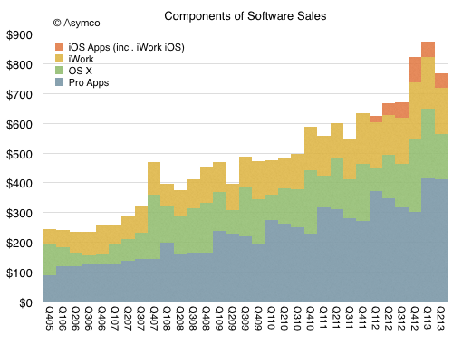
# An article from Asymco.com shows a graph where they try to show the
# revenues of the Apple software sales.
# I will try to clone the second graph [made with Numbers, as noted in the article].
from IPython.core.display import Image
Image(url="http://www.asymco.com/wp-content/uploads/2013/10/Screen-Shot-2013-10-24-at-10-24-5.08.54-PM.png")
# Image Source: Asymco.com
Out[1]:
In [2]:
# Imports are the same as last time
import matplotlib.pyplot as plt
%matplotlib inline

# this is a chart with four different bar plots overlapping.

# first! the X and Y axis
millions = [x*100 for x in range(10)]
# I will be lazy here and compose the quarters in three steps
quarters = ['Q' + qrt + '0' + str(year) for year in range(6, 10) for qrt in '1234']
quarters += ['Q' + qrt + str(year) for year in range(10, 14) for qrt in '1234']
quarters = ['Q405'] + quarters[:-2]
# create the figure
fig, axis1 = plt.subplots(figsize=(9, 6), dpi=75)

# set the Y ticks and set the limits of the graph
plt.yticks(millions, size=13)
plt.ylim((0, 900))
plt.xlim((0, len(quarters)))

# set the X ticks
plt.xticks(range(len(quarters)))
axis1.set_xticklabels(quarters, rotation='270', ha='left', size=11)
from matplotlib.ticker import FormatStrFormatter
# This is the printf like formatter, I am using it to display the '$'
currency_format = FormatStrFormatter('$%d')
# ant tell it where to use apply it
axis1.yaxis.set_major_formatter(currency_format)

# set the horizontal grid along the Y axis
axis1.yaxis.grid(True, linestyle='-', which='major', color='grey', alpha=0.5)
# and we know this happens
axis1.set_axisbelow(True)

# name the graph
plt.title('Components of Software Sales', size=14)

# clean the spines
axis1.spines['top'].set_visible(False)
axis1.spines['right'].set_visible(False)
axis1.spines['left'].set_visible(False)
axis1.yaxis.set_ticks_position('none') # This is still great!
axis1.xaxis.set_ticks_position('none')

# the title needs to a few pixels up
title_pos = axis1.title.get_position() # returns a pair (x,y)
new_title_pos = (title_pos[0], title_pos[1]+0.05) # .05 was trial and error
axis1.title.set_position(new_title_pos)

# Here comes the part that got me thinking about cloning this graph,
# since I don't have any data to reproduce it and the article does not
# tell where to get it.
x_range_len = float(len(quarters))

from numpy import arange
pro_apps = arange(100, 400, 300/x_range_len).tolist()
os_x = arange(200, 550, 350/x_range_len).tolist()
iwork = arange(250, 700, 450/x_range_len).tolist()
ios_apps = arange(-100, 850, 950/x_range_len).tolist()

x_range = range(len(quarters))
plt.bar(x_range, ios_apps, color='#dd7533', zorder=1, edgecolor='none', width=1, label='iOS Apps (incl. iWork iOS)')
plt.bar(x_range, iwork,    color='#d8b624', zorder=2, edgecolor='none', width=1, label='iWork')
plt.bar(x_range, os_x,     color='#8abe60', zorder=3, edgecolor='none', width=1, label='OS X')
plt.bar(x_range, pro_apps, color='#81a2b2', zorder=4, edgecolor='none', width=1, label='Pro Apps')

# set the legend
axis1.legend(loc='upper left', frameon=False, fontsize='medium',
             handlelength=0.9, handleheight=0.9)
# modify handle length and height to create squares

# add padding to the y
axis1.yaxis.set_tick_params(pad=12)

# place the copyright mark using LaTeX
plt.text(1, 920, r'$\copyright$ /\symco', size=12) # position, trial and error

plt.show()

Things missing:
- DATA!!!
- The legend has some padding between the items, have to learn how to compact it a bit.
Still this thing missing:
- figure out how to use the cells properly in the IPython notebook.
I failed to clone this graph, I tried to get the looking but without the raw data there is nothing I can do to get that done.
sbuj